

An event signage checklist can save a polished event from turning into a confusing one. Guests should not guess where to register, which ballroom to enter, or where the sponsor lounge begins. When signs are planned early, the room feels calm, branded, and easy to navigate. When they are rushed, lines get longer and the event looks less professional than it really is. That is why your signage plan should start as early as your event venue walkthrough checklist.
For conferences, AGMs, galas, launches, and tradeshows, an event signage checklist does more than label spaces. It guides traffic, supports accessibility, protects sponsor value, and helps the production team keep the day moving. It also saves money, because last-minute reprints, confusing placements, and duplicate signs add up fast. If you want guests to feel confident from arrival to final remarks, signage deserves a real plan.
Why an event signage checklist matters before show day
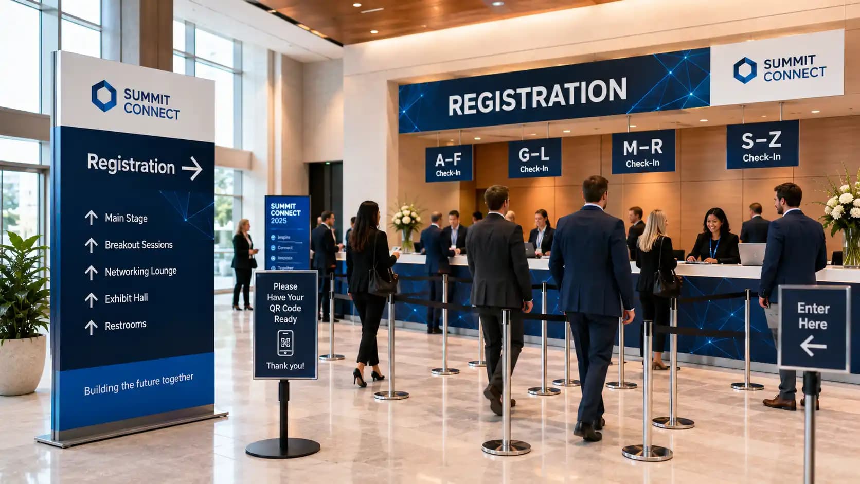
A strong event signage checklist reduces friction. Guests arrive with less stress. Staff answer fewer basic questions. Sponsors get clearer visibility. Meanwhile, speakers and executives spend less time being redirected by hand. Small signs often shape the first impression of the whole event.
Just as importantly, an event signage checklist supports accessibility and inclusion. Clear wayfinding, readable type, strong contrast, and logical placement help more people move through the space with confidence. If your team is planning a public-facing program in Ontario, review the Ontario accessibility framework and pair it with FPE’s own event accessibility checklist while you confirm paths, entrances, stage access, and guest flow.
Branding matters too. However, branding should not beat clarity. A beautiful sign that guests cannot read from ten feet away is decoration, not direction. Your event signage checklist should protect both goals at once.
What belongs on an event signage checklist?
The best event signage checklist starts with sign types, owners, and deadlines. Instead of asking for “some signs” near the end, define every sign by purpose. Then match the sign to a location, size, and decision point.
| Sign type | Main purpose | What to include | Common miss |
|---|---|---|---|
| Entrance signs | Confirm arrival | Event name, date, welcome message | Too small for lobby distance |
| Registration signs | Move guests into the right line | Alphabet split, QR check-in, VIP or speaker desk labels | One crowded sign above every queue |
| Wayfinding signs | Direct traffic | Arrows, floor names, room names, icons | Placement after the turn instead of before it |
| Session signs | Confirm people are in the right room | Session title, start time, speaker name | Outdated titles after agenda changes |
| Sponsor signs | Deliver visibility and value | Logo hierarchy, activation name, booth number | Logos without context or placement strategy |
| Stage and backstage signs | Support production flow | Reserved seating, green room, speaker ready room, crew-only labels | Missing labels in staff-only areas |
| Safety and service signs | Reduce confusion | Washrooms, coat check, exits, help desk | Inconsistent language across spaces |
When should signage be approved and printed?
Approve your event signage checklist earlier than most teams expect. First, lock the floorplan. Next, lock the agenda and sponsor deliverables. After that, confirm the final wording, file sizes, and placement map. Only then should you print. If the event includes stage content, timed sponsor moments, or speaker movement, review signage during the same planning window as your event rehearsal checklist.
As a rule, treat signage like production, not swag. Production items need version control, ownership, and backup time. Swag can often wait. Signs cannot.
Your event signage checklist from arrival to final session

An event signage checklist works best when it follows the guest journey. Start outside the room. Then move inward, one decision point at a time. If a guest has to stop and ask for help, you have found a signage gap.
How should registration signage work?
Registration signage sets the tone in the first minutes. A useful event signage checklist covers the approach to registration, not only the desk itself. Guests should know they are in the right place before they join a line. They should also know which line is meant for them.
Use large welcome signage at the first point of arrival. Then break registration into simple choices. For example, create separate signs for pre-registered guests, on-site registration, speakers, VIPs, exhibitors, or staff. If names are split alphabetically, make the letter ranges wide and readable. If QR codes are part of check-in, place one instruction sign before the queue starts, not at the tablet where people are already waiting.
This is also the moment to check staffing. If a sign sends guests left, a staff member should not wave them right. Your event signage checklist should align with the script your front-of-house team uses all morning.
What wayfinding signs prevent bottlenecks?
Wayfinding signs solve problems before they start. Therefore, place them at decision points, not at destinations. Elevators, escalators, lobby forks, hallway intersections, and ballroom entrances matter more than empty wall space that simply looks available.
Good wayfinding signs answer one question at a time. Where is registration? Which floor is the keynote on? Which room holds breakout track B? Where are the washrooms? Where is the sponsor lounge? If one sign tries to solve everything, guests stop walking to read it. That pause slows traffic, especially before sessions and after breaks.
Your event signage checklist should also account for height, lighting, and sightlines. A sign can look obvious in a mockup and disappear in a busy foyer. Likewise, mirror walls, dark drape, or backlighting can weaken readability. If your team wants a stronger design standard, review the accessible design guidance in the AccessAbility handbook from Accessibility Services Canada.
How do sponsor and exhibitor signs stay useful instead of cluttered?
Sponsor signage should feel intentional. If every surface carries a logo, nothing stands out. A smart event signage checklist assigns sponsor visibility by moment and by audience value. Entrance moments, registration backdrops, stage walk-ins, refreshment zones, charging stations, and networking lounges all offer different levels of attention.
That is why sponsor signs need context. A title sponsor may deserve premium entrance visibility. Meanwhile, a booth sponsor may need directional signs that actually drive traffic. If you are building packages at the same time, align the plan with your event sponsorship packages so promised exposure matches the physical setup.
For exhibitions, trade show signage must also help people act. Booth numbers, aisle markers, demo times, prize rules, and lead-capture instructions should be easy to scan. If your program includes an expo or sponsor showcase, FPE’s trade show production team can support both visibility and flow.
Does stage and room signage need its own review?
Yes, because guest-facing signs and production signs do different jobs. Your event signage checklist should separate them. Guest signage focuses on confidence and movement. Production signage focuses on timing, access, and precision.
Stage and room signage might include reserved front-row seating, interpreter areas, press positions, green room labels, cue-to-stage paths, speaker ready room signs, and backstage access markers. These signs rarely appear in the event recap photos, yet they keep the live show organized. They also reduce frantic last-minute questions from presenters and volunteers.
When branding matters onstage, the sign plan should work with scenic elements instead of fighting them. A freestanding sponsor sign may help in one room. In another room, it may block a camera line or cheapen the stage picture. That is why signage, scenic design, and room styling should connect early. FPE’s decor services can help teams build branded event signage into the full look of the space.
How much should an event signage checklist cost without wasting budget?
An event signage checklist should protect the budget, not stretch it. The trick is to spend where confusion creates the biggest operational cost. In most events, that means arrival, queue management, directional flow, sponsor commitments, and stage-critical labels.
Spend more on the signs that carry distance, traffic, or brand weight. Save on the signs that only support short-range confirmation. For example, a lobby welcome sign, registration queue banner, and main ballroom identifier usually deserve better materials and larger sizes. By contrast, internal staff labels or backstage reminders can stay simple if they are readable.
Where should you spend more?
Spend more on these items first:
- Arrival signage that confirms guests found the right event
- Registration signage that reduces queue friction
- Wayfinding signs placed before major turns or floor changes
- Sponsor signs tied to contracted value
- Main-stage branded signs or scenic pieces that appear in photos and video
Where can you save without looking cheap?
Save money by standardizing formats. Reuse easels, frames, and sign holders across multiple events. Build templates for room IDs, agenda boards, and directional arrows. Combine static print with venue screens when the content may change. Also, avoid printing too early. Reprints cost more than patience.
You can save further by reducing duplicate signs. Many teams add signs because they feel unsure, not because the guest journey needs them. Walk the route yourself. If one sign solves the decision clearly, do not add three more versions of it ten feet apart.
Common event signage mistakes that guests notice fast
Even experienced teams can weaken an event signage checklist with a few avoidable choices. Watch for these mistakes.
- Using brand language that guests do not understand. Internal project names confuse attendees. Use plain public-facing wording instead.
- Printing before the floorplan settles. Room shifts create waste immediately.
- Placing signs at the destination, not before the decision. Guests need the arrow before the turn.
- Letting logos overpower information. Sponsor value rises when the message stays readable.
- Ignoring accessibility basics. Poor contrast, low placement, tiny fonts, and crowded layouts make navigation harder.
- Forgetting staff-only signage. Backstage confusion still affects the guest experience.
- Skipping a final walk-through. A sign plan on paper is not the same as a sign plan in a live lobby.
Before print approval, walk your event with one question in mind: what would a first-time guest need to see next? That single exercise usually improves the event signage checklist more than another design revision does.
Turn your event signage checklist into a smoother show day
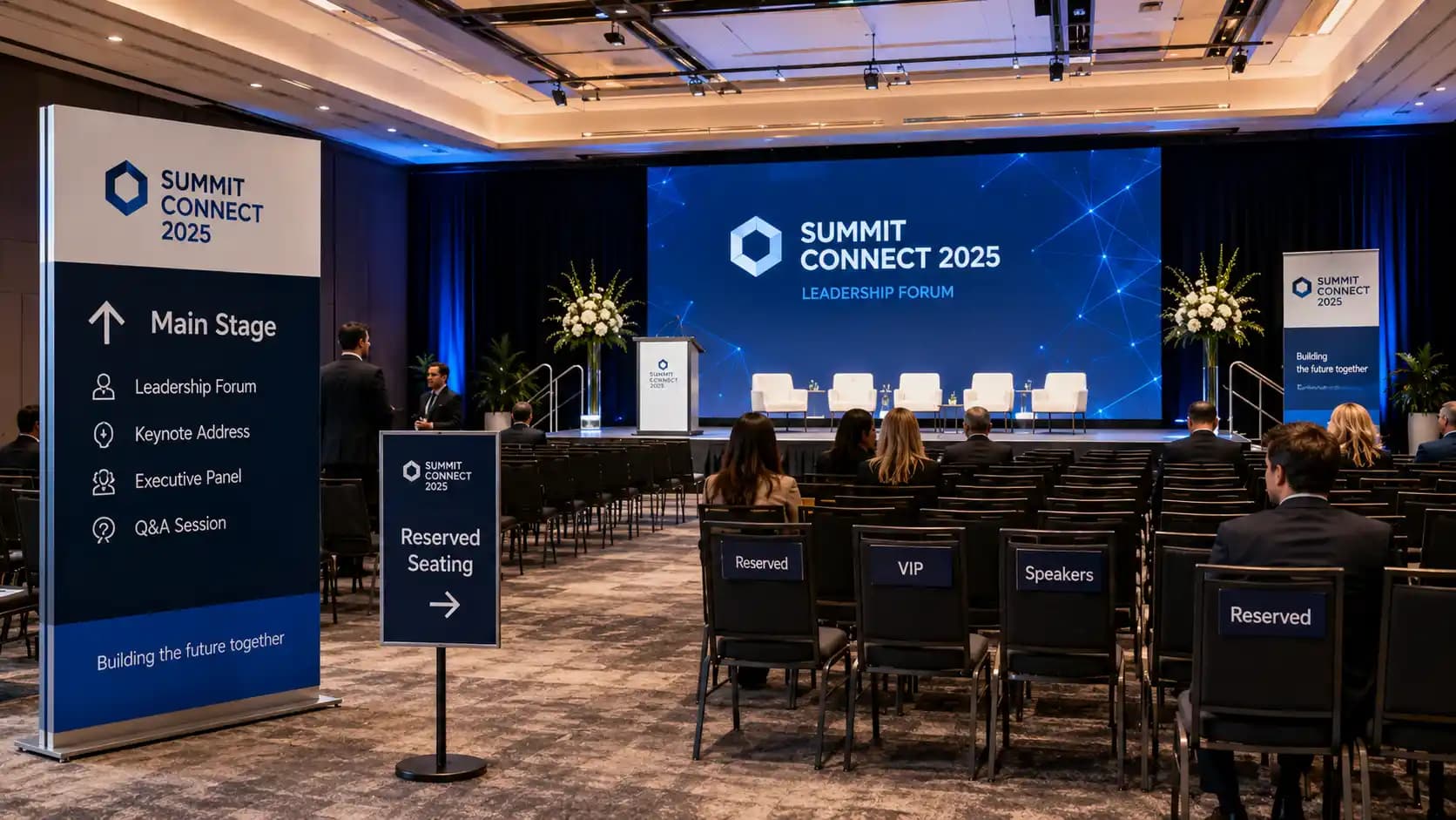
A practical event signage checklist helps people feel looked after. It protects your brand, supports accessibility, and makes the venue easier to navigate. More importantly, it takes pressure off your staff when the pace picks up.
If you are planning a conference, AGM, gala, launch, or expo, Future’s Past Events can help connect signage with the rest of the production plan. Their corporate event production services and design-led venue support help teams think through guest flow, sponsor visibility, scenic branding, and show-day logistics together. When you are ready to map the room and make each sign earn its place, you can start the conversation through the contact page.
Related posts
Awards Show Production: 10 Steps to a Ceremony That Runs on Time
Awards show production is what turns a list of winners into a night people remember. Every category needs a clean reveal, every winner needs to reach the stage without a long silence, and the whole program has to finish before the room loses its energy. That only happens when the show is…
Corporate Holiday Party AV: 9 Steps to a Memorable Year-End Night
Corporate holiday party AV decides whether the evening feels like a celebration or like a conference room with a buffet. The CEO's toast has to be heard over three hundred conversations, the year-in-review video has to play on cue, and the room has to change from dinner to dance floor without…
Town Hall AV: 9 Steps to a Clear, Reliable Corporate Town Hall
Town hall AV can make the difference between a leadership message that feels clear and confident and one that gets lost in weak audio, hard-to-read slides, awkward transitions, or a poor remote experience. A corporate town hall may look like a simple meeting, but once you add executives, audience Q&A, presentations,…